

Can design really make food taste better? In a sense, yes. Most people are familiar with the phrase ‘we eat with our eyes first’, and it’s the entire reason parsley garnishes, jello molds, and carved butter roses exist. But, a finished dish is also the result of a long series of choices, from the choice of ingredients to cooking method to presentation.

Selecting fresh, high quality raw ingredients is easy with experience, but how do you determine the quality of prepared foods and ingredients? This is where design and packaging become essential. After first setting an expectation of the quality of the product, your design and packaging are also responsible for making an impression that is appetizing, appropriate, and honest, or as we like to say: ‘edible’. By the way, this isn’t something I just pulled out of the ether. I was introduced to the practice of ‘edible design’ while working alongside Chad Roberts, the principal of a Toronto design studio well known for their work in restaurant branding and food packaging.
So what exactly makes design ‘edible’? Ha! Trick question! The impression of ‘edible’ is purely subjective, and is hugely informed by the audience being designed for. For example, I’m confident saying that bright, garish squeezy-pop packaging probably doesn’t create an edible impression with health nuts, and that an understated granola wrapper might not be the first thing an 8-year old grabs off the shelf. See what I mean? Both solutions are highly edible to their target audiences, yet might be considered inedible-looking by people outside that audience. This is one situation where the phrase ‘I’ll know it when I see it’ takes on a life of its own. Like a lot of design problems, there isn’t a magic bullet solution to creating edible design, but there’s a few big issues to consider.
Colour
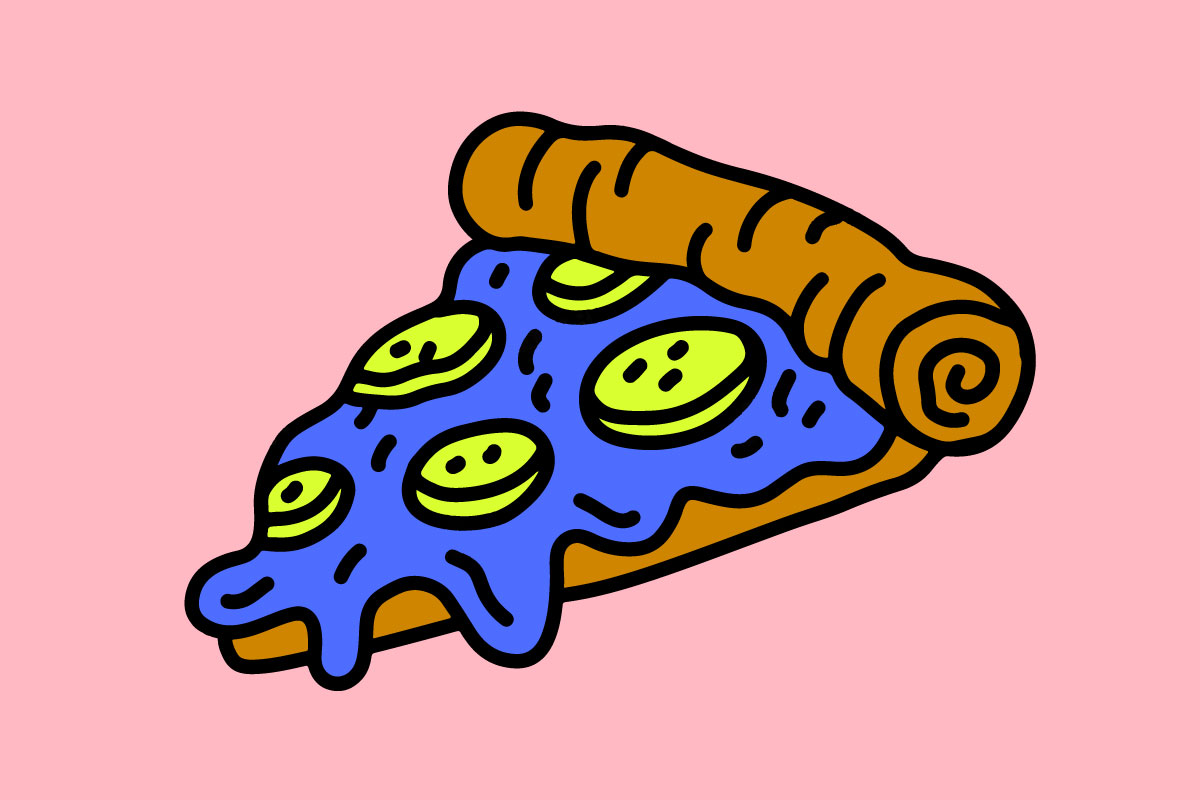
This is a big one. When creating a colour system that feels edible, it’s important to consider the tones and colours found naturally in food. For example, vegetables cover the entire colour spectrum with one notable omission: blue. Can you name a blue vegetable? Like, actually blue, and not purple? Probably not, or at least not many. There’s a few theories that attempt to explain this, but nearly all of them touch on the fact that humans and animals have evolved to find the colour blue unappetizing, and that blue may actually function as an appetite suppressant. I have no idea if the explanation is true, but the fact remains: Blue and edible packaging do not mix. Teal? Sure. Purple? Go for it. Blue? Blech.
Colour saturation can also make a big impact. Rarely in nature do we find crisp whites, dense blacks, or neon-bright hues. Naturally occurring tones tend to be less saturated, more muted, and less pure. Remember the health nut from up above that probably didn’t find a squeezy pop too appetizing? Part of that response is reasonably rooted in the fact that super-saturated, garish colours on food are legitimately unnatural. Sure, a ripe orange is very orange. But it isn’t safety-vest orange.
Design Language
It seems a bit obvious to say that you need to consider your audience when deciding on a design direction, but when it comes to food and beverage packaging it’s a pretty huge deal. Consumers have come to expect a certain ‘look & feel’ for familiar product categories. Back in design school we called this a paradigm. When I was younger and less experienced I might have said ‘Screw that! We’re gonna DISRUPT THE PARADIGM!’ and proceeded to design the most ornate cereal box ever, or perhaps a caviar brand that felt like it had ‘authentic street cred’. Not only are those concepts nonsensical, they’d have failed terribly if they ever made it to market. For the most part, people expect their cereal to look like cereal, and their caviar to look like caviar. And that’s ok! As much as designers focus on originality and the ‘new’, people need a certain amount of familiarity to feel comfortable. And when you’re dealing with food, comfort isn’t something to be taken lightly. A massive part of making something appear ‘edible’ is knowing what consumers expect your product to look like. The goal isn’t to reinvent the wheel, it’s essentially to create something that appears appealing and delicious, while still fitting within its general category (unless you’re trying to disrupt the paradigm, however that’s another situation entirely).

I realize the points above are pretty high-level considerations, but that’s about where the similarities between each project like this end. Each context needs to be considered individually, and although I can describe the general recipe, every project will have to be seasoned to taste.
– THE END –
INQUIRE
Careers
[email protected]
+1 604 910 7160
- By Appointment Only
15b Commercial St.
Nanaimo, BC
Canada, V9R 5G3
NEWSLETTER
FINEPRINT