


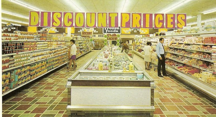
Growing up, my town had two versions of most stores: the ‘classy choice’, and the ‘budget choice’.

When it came to department stores, we had the Bay and Zeller’s. The Bay was a hallowed Canadian institution, and Zeller’s was the most budget you could get. Zeller’s had their own in-house budget brand (that’s double-budget, if you’re counting) called Venture that offered pretty much everything the regular brands did, just at a lower price point and at noticeably lower quality. As kids, we had no clue what a “budget brand” was’, but we knew anything Venture brand broke faster. So, we adopted ‘Venture’ as kind of a catch-all term for anything uncool, busted, or lame. Too much homework? “That’s venture!” Want to dis someone’s sneakers? “Those shoes look pretty venture…” Mom wants you to cut the lawn? “MAHM, THAT’S TOTALLY VENTURE”. You get the point…
We didn’t decide to pick on Venture out of malice. Their packaging was less professional than the name brands, and their products always seemed to look less credible on the shelf. To put it bluntly, everything Venture made looked cheap. To my friends and I that made them the butt of a joke, but to our parents it made it easy to tell the affordable options from the more expensive name brands. So ultimately even though Venture products looked (and were) inferior to most other brands on the shelves, I’m willing to bet that their products sold as well, if not better than, many more expensive brands. This is at least in part due to the fact that their lower production value, less sophisticated design, and louder colour palettes conveyed immediately to shoppers that they were budget items.
As the anecdote above clearly shows, every retail package tells us more than just its contents and expiry date. Production value, material choices and design language combine to set an expectation of price point for shoppers. This happens in nearly every industry, but as we specialize in food packaging we’ll use that as an example. Starting with economy and working our way up to imported specialty, we’ll look at how each packaging tier has evolved to appeal to a particular type of shopper.
Now we just need a product that you can find at any price range, from low budget to top shelf specialty. How about… Pasta!
Economy
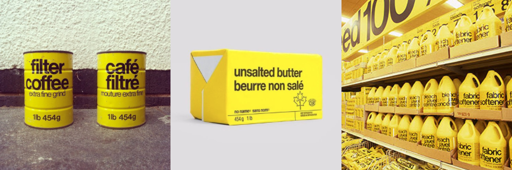
Budget brands usually opt for bold primary colours, shelf presence, and large package volumes. They often forego illustration and photography entirely and instead give the product name precedence. The gold standard of this genre is Don Watt’s bright yellow packaging system for Loblaw’s in-house brand, No Name, launched in 1978 and still in use today.

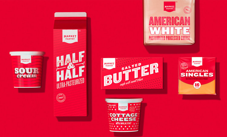
A more contemporary example is Target’s Market Pantry economy house brand. Designed by Target in collaboration with Pearlfisher in 2012, the packaging employs playful retro type but still feels ‘economy’ due to the use of a primary red.
Mainstream Grocery
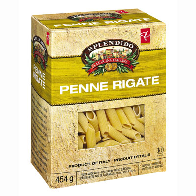
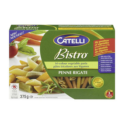
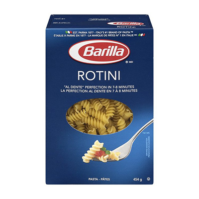
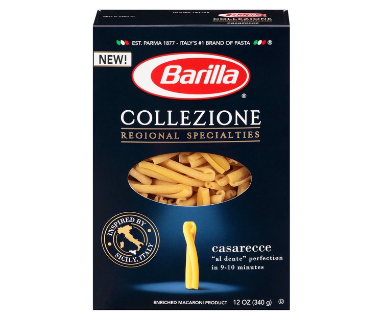
I’m sure we could get more granular than this, but in an effort not to split hairs we’re going to consider 75% of what you see in regular grocery stores to be one category; Mainstream Grocery. This covers everything from mid-level in-store brands like President’s Choice or Western Family all the way up to national and international stalwarts like Oreo or Cheerios. Visually this category becomes a bit more sophisticated, with the primary tones of the economy brands replaced with subtler hues. Illustration and photography feature prominently, and often highlight the product’s quality or authenticity by making a connection to the past. Package volumes also come down to a more reasonable size, and the packages themselves often incorporate custom die cuts and combined materials (like paperboard with clear film windows).
Specialty Grocery
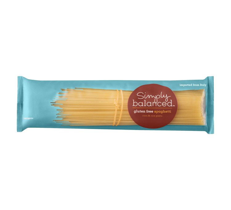
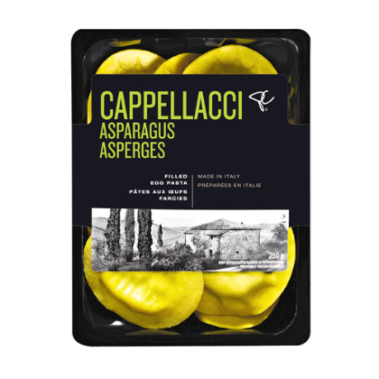
This is where things start to get a little more interesting. Specialty Grocery is how we describe the premium items that are still available in regular grocery stores, as opposed to specialty food markets, like President’s Choice Black Label. Visually we’re seeing a lot more attention paid to engaging typography, subtler colour tones, and limited use of photographs and illustration. This price level is also the beginning of a shift towards purely typographic packaging, which becomes more common as prices rise.
At this point we’re going to leave the grocery store, and travel to our local* specialty food market. By ‘specialty food market’ I mean places like Whole Foods, Trader Joes, or on a more local level Meinhardts in Vancouver or Pusateri’s in Toronto. These aren’t the sort of places most people shop at for day to day items, and most people shopping at these retailers are happy paying a premium for a perceived increase in quality.
*Many people live in places that don’t have a local specialty food market, so if you fall into that category please replace this term with “the Internet”
Generic Premium
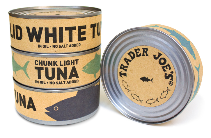
Ironically, the tiers we find in specialty stores almost exactly mirror those found in the regular grocery store. In the premium category we still find generic house brands, and visually these are quite similar to their cousins in Specialty Grocery. Somewhat formal type plays a very prominent role in most cases, and photography and illustration are largely absent. There is, however, one notable exception. Trader Joe’s playful, tongue-in-cheek approach to packaging makes their brand stand apart, however their intentionally ‘slapdash’ execution is meant to place them firmly at the low end of the price spectrum.
Premium
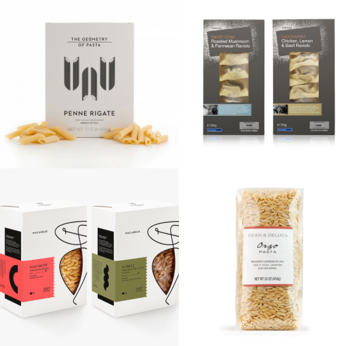
For all intents and purposes this is the top tier when we’re discussing packaging. At this level we see little to no photography, and illustrative elements also become less common. Instead, sophisticated typography, minimal colour, luxurious textures, and pattern are combined to create an impression of luxury and sophistication. Think Williams-Sonoma, or Dean & Deluca. Additionally, at this level we don’t see a shared design language across brands like we did at some of the lower levels. At a premium price point, visual differentiation and brand recognition become more of a concern, which results in far less visual overlap.
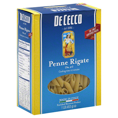
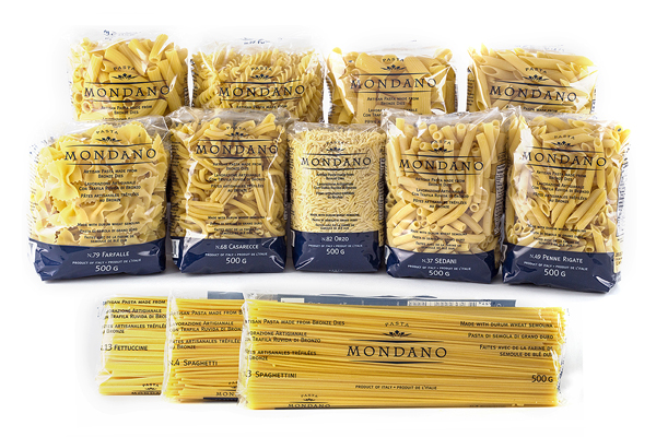
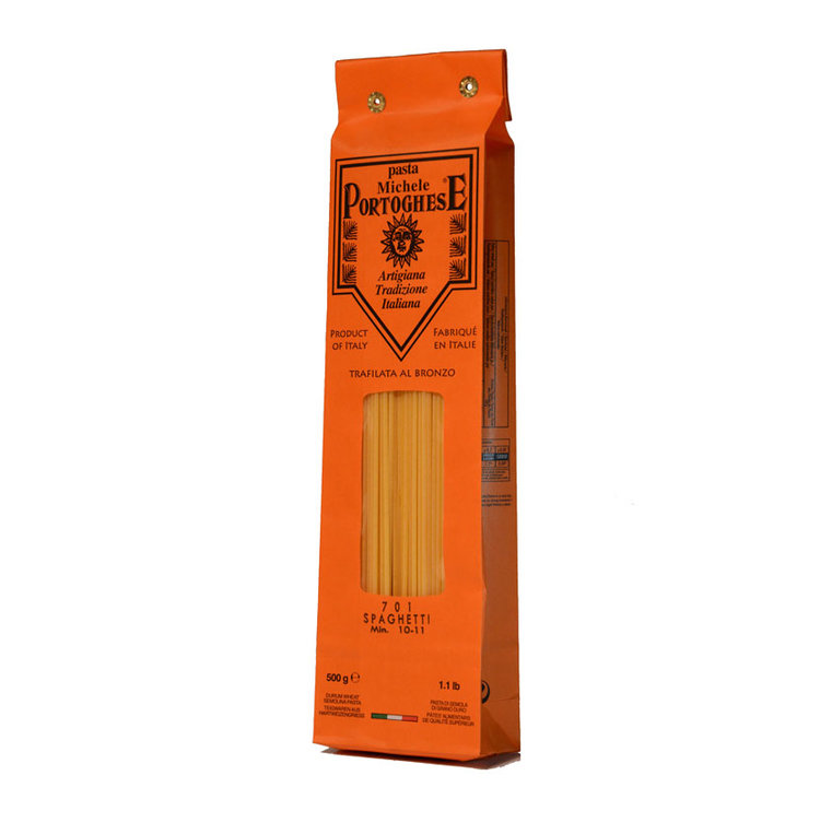
Import Specialty
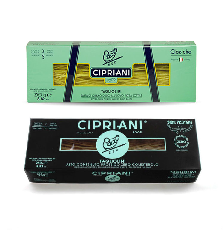
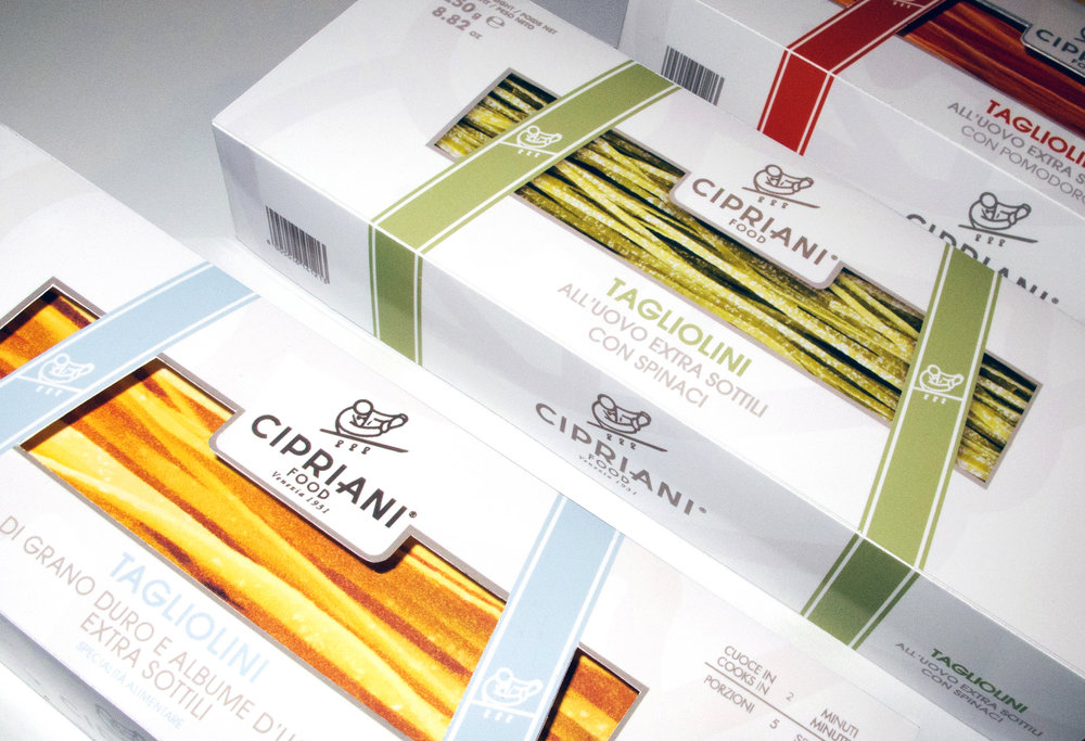
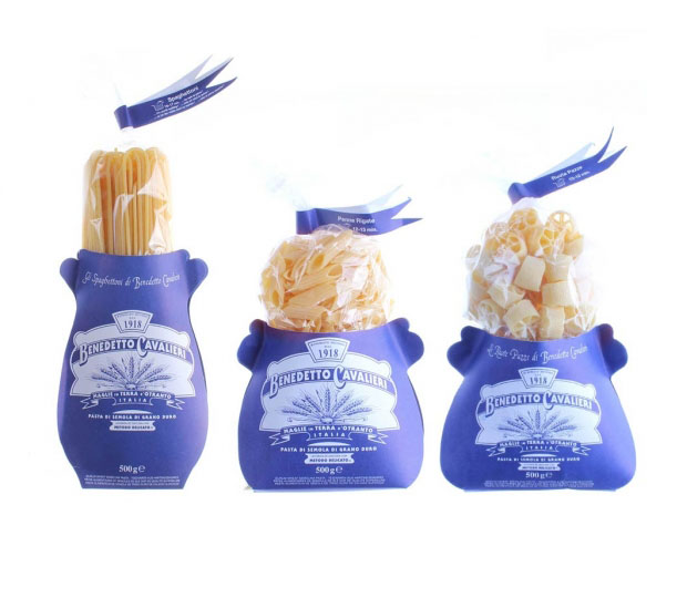
Import specialty brands share much in common with domestic premium brands, with one major difference being that they’re designed to appeal to a foreign consumer. This could explain why some of the import pasta brands below look almost comically “Italian” to North American eyes (I’m looking at you Bendetto Cavalieri). You know that saying about every cliche beginning with a grain of truth? This would be a good time to take a look back at some of those packages from the Mainstream category up above and notice how they’re taking elements from some of the examples here (ribbons, banners, curved type, enclosed logos) and using them as visual shorthand for “Italian”.
And of course, at this level we also find some genuinely beautiful packaging for some of the world’s finest quality products.
As I’m sure you can now see, creating effective branding and packaging isn’t just a matter of creating an appealing product. An experienced packaging designer should be able to provide you with more than just a visually compelling design, they should be presenting a solution that helps set an expectation of price point and quality level. Even if that quality level is ‘the lowest’, and kids end up making fun of your brand on the playground.
– THE END –
INQUIRE
Careers
[email protected]
+1 604 910 7160
- By Appointment Only
15b Commercial St.
Nanaimo, BC
Canada, V9R 5G3
NEWSLETTER
FINEPRINT