


Every few years we see a resurgence in sophisticated packaging design with tons of white space and minimal information. There’s nothing wrong with minimalism and restraint, but when dealing with food & beverage packaging it’s also important to make sure all the required information is shown… in fact, it’s the law.

Food labelling guidelines exist to make sure consumers are informed about nutrition, and so that potentially dangerous foods are clearly identified (with allergy warnings, for example). Canada has strict rules about what terms must appear in both French and English, doubling the amount of copy we’re required to consider. All of this information can quickly bog down that “clean and minimal” design we were just talking about earlier. As the responsibility for correct labelling lies with the producer, it makes sense to work with a designer that’s comfortable with Canadian labelling laws. That way, your product will look great, and you can be sure that you’re still on the right side of the law. Here’s a quick list of Do’s and Dont’s covering some of the basics of packaging design:
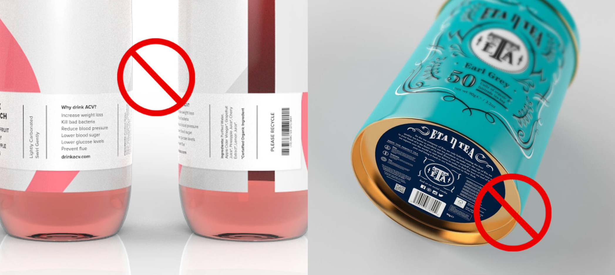
UPC Implementation
Designing a functional product label requires a familiarity with implementing UPC codes. Often novice designers will attempt to shrink the barcode, or change its colour to better fit their design. However, these modifications can render the barcode unreadable.
Do
- Use the barcode at 100% size
- Add clear white space on all sides
- Add a white backup if printing on clear labels so that the scanner will recognize it
- Use black (or the darkest colour available) for the UPC code
- Test your barcode with a barcode scanner once printed to confirm it works
Don’t
-
- Shrink the barcode more than 20% (try to avoid scaling entirely)
- Use a light colour for the barcode image (scanners do not pick up white barcodes)
- Stretch or squash the barcode.
- Vertically truncate the barcode, unless absolutely necessary. This is the practice of trimming some of the vertical height from a barcode while leaving the overall scaling untouched.
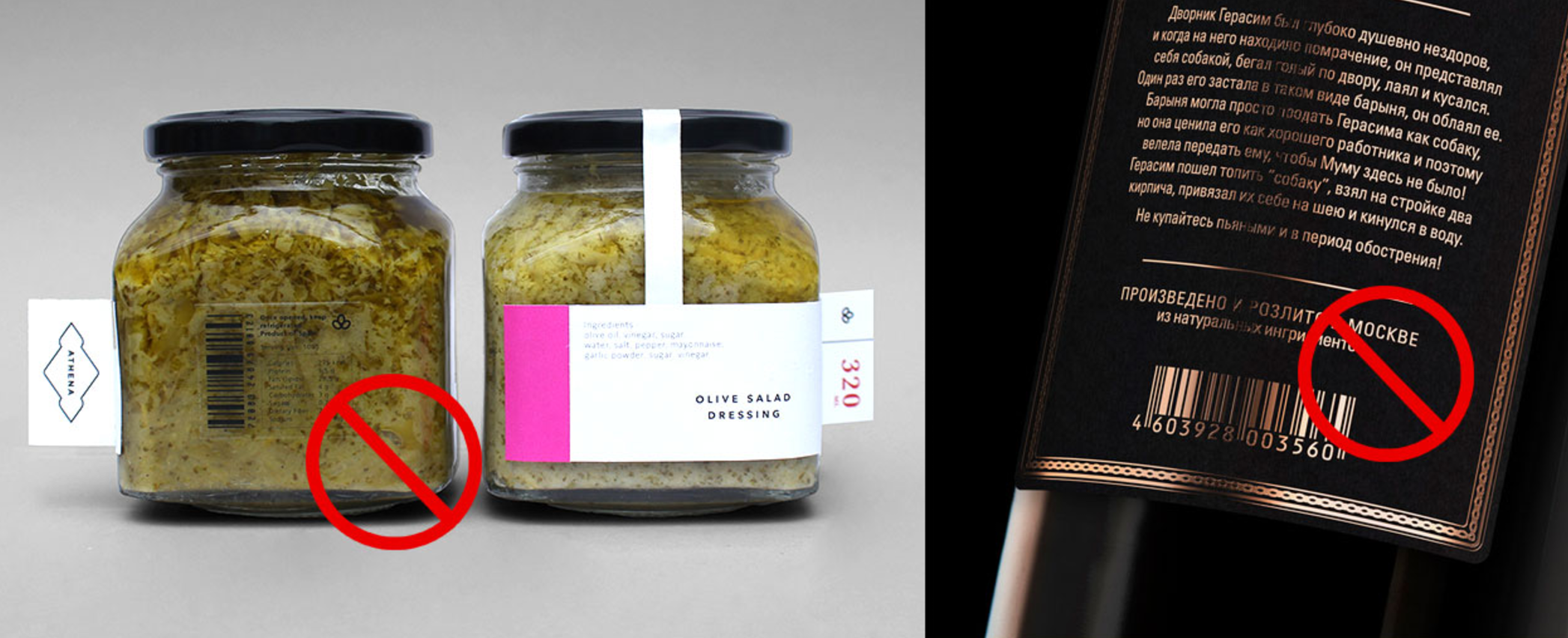
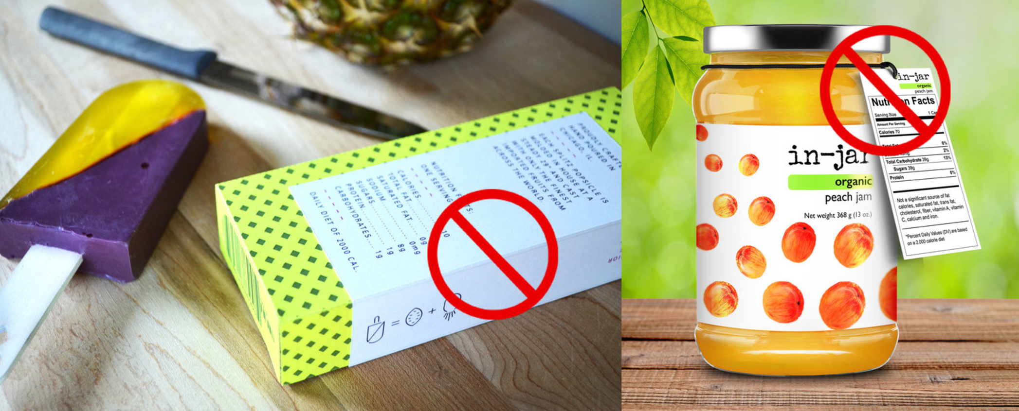
Nutrition Fact Tables
These tables are almost always provided to designers by their clients (they’re generally supplied by the same labs tasked with determining a product’s nutritional makeup), and are often placed into packaging files verbatim. However, designers will have to create a Nutrition Facts Table from scratch using the guidelines provided by the CFIA. They’re ugly as sin, but they’re required by law, and the law describes their sizing and usage guidelines to the letter (pun intended). This makes it very obvious when a novice or inexperienced designer has attempted to skirt the rules by either setting the table themselves, or attempting to place it on a ‘less important’ part of the package.
Do
- Use Nutrition Facts Tables as supplied, at 100% size.
- Make sure the table has a white background
- Place the table according to regulations (eg. not on the bottom of the container, not on a section that can be removed, etc)
- Follow the CFIA guidelines exactly, if creating from scratch
Don’t
-
- Change the fonts, rules, or spacing of the table
- Change the colour of the table
- Shrink or enlarge the table
- Obscure the table in any manner
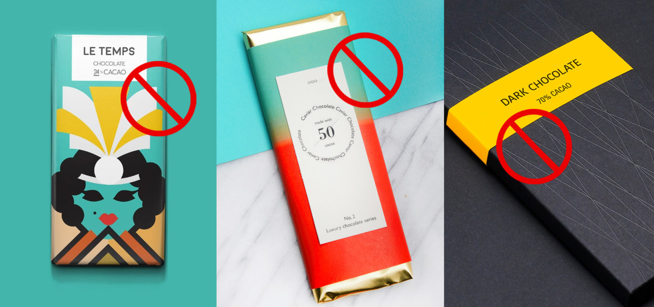
Essential Information
Just like nutrition facts and barcodes, things like ingredients lists, allergen warnings, weight indications, and product origins are all regulated and required. Where they appear, and at what sizes, is also regulated. Again, not including these elements might be tempting from a designer’s perspective, but omitting them would be a huge headache for the client (and could result in legal ramifications later on).
Do
- Make sure all ingredients are properly indicated using correct terms
- Make sure any allergens are identified using a proper ‘Contains…” statement
- Check that net weight is the proper height for the size of your package
- Properly indicate the product’s country of origin, as well as the manufacturer/importers domicile information
- Ensure that all essential information is present in both French and English
Don’t
-
- Move essential information off the primary display panel
- Include any product claims that contravene regulations
- Include any organic claims without including the name of the certifying body
- Make any claims regarding health benefits or product performance without first verifying their legality
- Include any type where the lowercase letter ‘o’ is less than 1.6mm high. Yes, you read that right. Not 1.5mm, 1.6mm.
Type Sizing
One hurdle many digital designers have to get over is the relationship between on-screen type sizing, and sizing type for print. It’s easy to forget that printed documents and packages don’t include a zoom function, and often a designer’s first instinct is to make many elements far smaller than they actually need to be. The only way to truly judge if type sizes are appropriate is to print out your label, and look at it on the actual product. There’s simply no way to replicate the experience of reading a label without being able to hold and rotate it, and doing so will often allow the designer to identify tiny issues with spacing and scaling that would otherwise go unnoticed on screen.
Do
- Build mockups throughout the design process to test solutions
- Make sizing choices based on printed examples, not screenshots
- Determine a minimum type size early in the project
- View your production mockups against the competition, in retail locations if possible
Don’t
-
- Make your type too small (am I starting to sound like a broken record yet?)
- Trust digital mockups without also creating a physical one
- Assume everyone’s eyesight is as good as yours. Some people might find that 5pt condensed sanserif a lot harder to read than you do.
- Abuse type just to make it ‘fit’. I’m looking at you, designers who horizontally scale ingredients lists to the point of incoherence.
So, after all that talk about rules, regulations, and tiny typefaces you might be thinking that designing a good-looking package that’s still legally compliant is almost impossible. Well, it’s not! It’s just a lot more complicated than it might appear at first glance.
– THE END –
INQUIRE
Careers
[email protected]
+1 604 910 7160
- By Appointment Only
15b Commercial St.
Nanaimo, BC
Canada, V9R 5G3
NEWSLETTER
FINEPRINT