

In the early 20th century, graphic design was stripped of all ornament in an effort to uncover its purest, most fundamental form. And there, way down under all the Art Nouveau foliage and Victorian scrollwork, was the cornerstone of modernism: that design should be used to inform, not deceive. Used skillfully, graphic design can be an extremely persuasive tool. But like any persuasive tool, it can be used to misinform just as effectively.

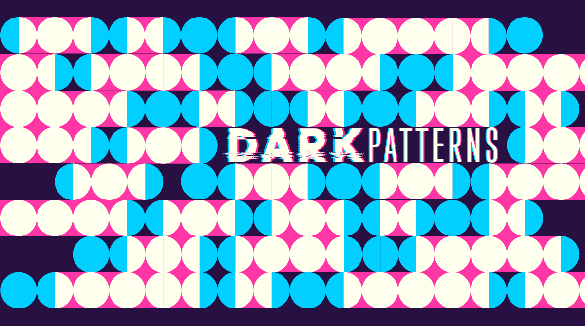
Fast forward to the early 21st century. The Internet is a publishing free-for-all, mobile connectivity has enabled brands to become entities that exist in real-time, and in some areas of digital design that old modernist ‘pursuit of honesty’ thing didn’t translate. As soon as people began monetizing websites, they began searching for ways to get as many visitors/subscribers/customers as possible. Not surprisingly, some of the least honest tactics were also the most effective. You’ve seen them… The banner ads masquerading as system notices? Pages that generate a new pop-up window on each click? Sites that add products to your cart that you have to remove manually? Sites that don’t show you the true price of an item until checkout? ‘Dark Patterns’, as these tactics are referred to, are not only inherently misleading, they weaponize the persuasive potential of design through deception.
As a packaging designer, I have a very special relationship with deception. Way back when design magazines could still be found on all reputable newsstands, two design luminaries squared off in the pages of Print Magazine debating whether the entire specialization of packaging design was a Dark Pattern. The debate is pretty well summed up in the following exchange between Joe Duffy and Tibor Kalman (a little background: Joe Duffy was the designer responsible for bringing historically-inflected design into the mainstream with his design for Classico pasta sauces in the late 1980’s. Tibor Kalman was the founder of M&Co, a highly cerebral NYC design firm that worked mainly with more specialized clients and became well-known for their avant garde self-promotional products. The full interview, along with images can be found here).
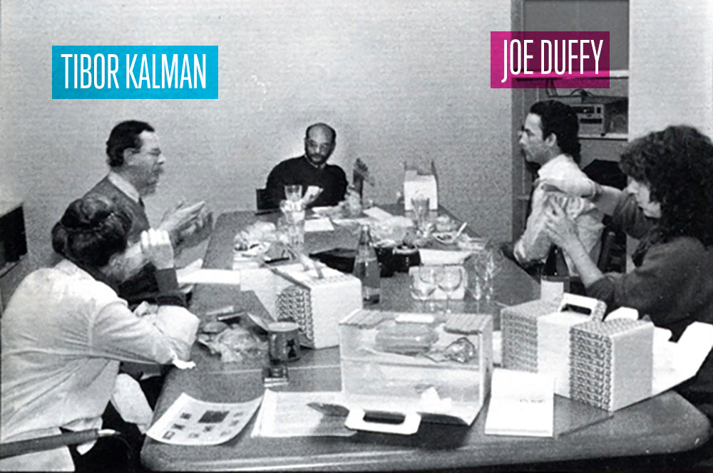
DUFFY:
“The package itself is part of the product. It’s not just what’s in the container; it’s everything that’s part of it. If the package is better, for any number of reasons, the product is better.”
KALMAN:
“I don’t think that’s true. I think that’s the big lie of marketing.”
Keep in mind this debate took place in 1991, back when postmodernism was still edgy and controversial. People still believed in big ideas, and the design profession was still firmly ensconced in an ivory tower that wouldn’t begin to completely crumble for another decade. It was a time when formal design criticism was starting to flourish, and debates that began at design conferences spilled over into the pages of magazines.
Today, design is an integral element of the global online economy. Branding and packaging design are now often the only differentiator (other than price) when shopping online, giving them even greater weight. In the context of our contemporary image based economy, Tibor’s strident claims about the evils of marketing seem quaint, and almost naive. Today’s consumers define themselves via the brands they align with to a far greater extent than they did 30 years ago, and the narratives and ethos that those brands communicate become the narratives of the consumers themselves. Thankfully, authenticity, corporate responsibility, and environmental awareness are all much larger considerations for today’s consumers than they were in the past, making dishonest design that much less attractive.

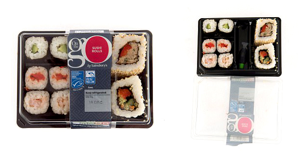
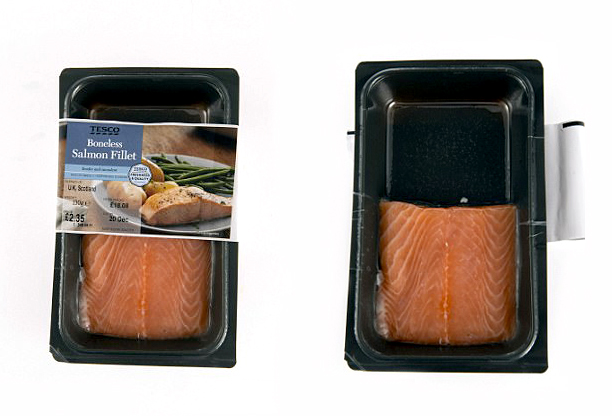
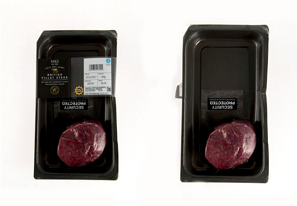
With this in mind, I was extremely surprised when I recently came across an article outlining how four of Britain’s major grocery chains had begun packaging food items in a manner that implied one thing, but delivered far less. As the examples show, the packages have been designed to imply that they contain a certain volume of food based on their physical dimensions. However, once opened, it becomes apparent that much of the package was actually dead space and that the portion is a much smaller size than the package leads the consumer to believe. Not only is this practice blatantly deceptive, it contributes far more waste than necessary to landfills, all in order to create the impression that the product is a better value than it really is.
The practice of using Dark Patterns or deceptive tactics, to put it bluntly, is bullshit. It’s damaging to the credibility of the brands involved, damaging to the integrity of the designers responsible, and ultimately undermines the credibility of the packaging design profession as a whole. Designers really do have an ethical responsibility to consider how their work is perceived by the end user, and the impact their work has on the environment. Even though Tibor and I might disagree on the ‘big picture’ ethics of packaging design, I think he’d be as disgusted by the above example as I am.
– THE END –
INQUIRE
Careers
[email protected]
+1 604 910 7160
- By Appointment Only
15b Commercial St.
Nanaimo, BC
Canada, V9R 5G3
NEWSLETTER
FINEPRINT